
From Figma to WordPress: A Component-First Design and Accessibility Checklist
A practical approach to designing reusable WordPress components, defining accessibility requirements early, and reducing inconsistencies between design and implementation.
A complete page design is not necessarily a development-ready design
A WordPress website is not simply a collection of individually designed pages. It is a system of reusable blocks, components, patterns, and global styles that must work consistently across different layouts, content types, and user interactions.
This distinction has important implications for how a website should be designed in Figma.
A visually complete page may communicate the intended appearance of a website, but it does not necessarily provide enough information to implement that website as a maintainable, accessible, and reusable system.
For example, a design may include several buttons across different pages, each with slightly different padding, border radii, colors, or typography. Although these differences may be difficult to notice when reviewing the pages individually, they introduce ambiguity during implementation.
Are these intentional variations? Do they represent separate components? Should a change to one button affect every other button? Which version should be used when the client creates a new page?
Without a shared component system, developers must interpret these differences and make implementation decisions that should ideally have been established during the design phase.
The result is often a growing collection of local CSS overrides, additional block variations, and exceptions that make the website harder to maintain.
Why components should be designed before pages
WordPress provides a modular editing environment built around blocks. Native blocks such as Buttons, Paragraphs, Headings, Images, Groups, and Columns can be combined with block patterns and custom blocks to create increasingly complex layouts.
The same basic components may appear in hero sections, cards, banners, navigation areas, and other reusable sections.
A button used in a hero section should not require a completely different implementation from an equivalent button used in a call-to-action banner.
Instead, both should rely on a common visual and functional definition, with explicitly documented variations where necessary.
This is where a component-first design approach becomes valuable. Before assembling complete page layouts, the design system should establish:
- Global design tokens for colors, typography, spacing, borders, and layout.
- Core elements such as buttons, links, form controls, and navigation controls.
- Interactive states and accessibility requirements for each element.
- Reusable composed components built from these smaller elements.
- Responsive behavior and content-related edge cases.
The Button block: A practical starting point
One of the most useful components to establish early is the Button.
WordPress includes a native Button block (core/button), which can be styled through global theme settings, block styles, and additional CSS where required.
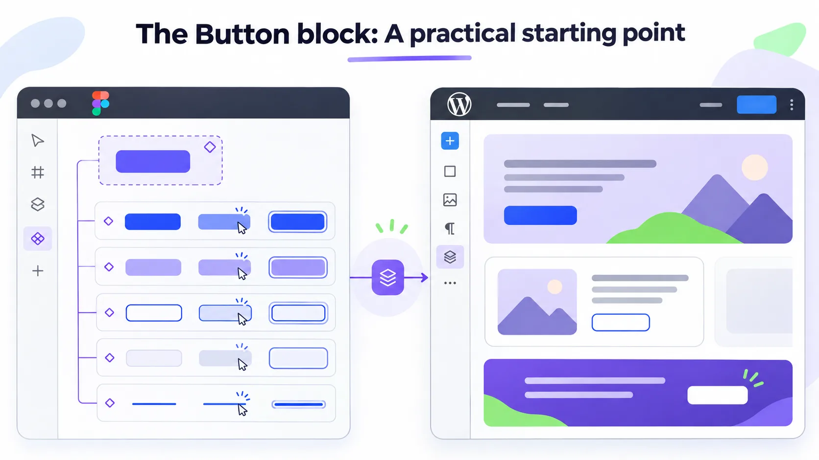
Button styling also influences many other parts of a website because button-like controls are used throughout the interface.
In practice, an interactive control may be implemented as a WordPress Button block, an HTML <a> element, or a <button> element, depending on its purpose. Navigation and actions require different semantics, even when their visual appearance is similar.
From a design perspective, these controls should still follow a coordinated visual system.
A Button component should define more than its default appearance.
At minimum, the design should include:
- Variants: Primary, secondary, outlined, ghost, and text-based buttons, where applicable.
- States: Default, hover, keyboard focus, pressed, and disabled or unavailable states where relevant.
- Dimensions: Padding, minimum height, border width, border radius, and icon spacing.
- Typography: Font family, weight, size, line height, and text decoration.
- Content behavior: Long labels, multiline text, optional icons, and different available widths.
- Accessibility: Text contrast, visible focus indicators, target size, and interaction feedback.
These decisions should be made in relation to the global design tokens, rather than independently for each button instance.
Buttons are also an effective way to evaluate whether the underlying design system is sufficiently defined.
They bring together color, typography, spacing, borders, layout dimensions, and interactive behavior within a single component.
Accessibility cannot be treated as a final visual adjustment
One of the most significant problems with incomplete component design appears when accessibility requirements are addressed only after the visual implementation is largely complete.
Accessibility is sometimes approached as a separate review stage in which keyboard focus indicators, contrast improvements, and other interaction-related adjustments are introduced.
Although accessibility testing is necessary throughout development, leaving the design of accessible states until this stage creates avoidable complications.
Consider a button with a carefully selected border, background color, and corner radius.
If its keyboard focus indicator has not been designed, the developer must decide how it should appear. An outline might be introduced around the button. However, depending on the existing styling, that outline may:
- Visually compete with the button’s border.
- Create an unintended double-border appearance.
- Appear too close to adjacent elements.
- Have insufficient contrast against the surrounding background.
- Become clipped by a parent container.
- Look inconsistent with focus indicators used elsewhere on the website.
Borders and outlines need to be designed together
CSS borders and outlines serve different purposes.
A border generally contributes to an element’s box dimensions, while an outline is drawn outside the element’s border edge without affecting the box model.
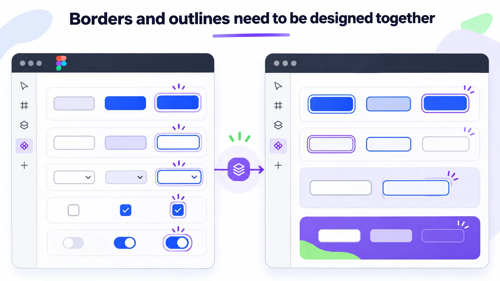
This makes outlines particularly useful for focus indicators. However, their appearance must be considered alongside the component’s existing border, background, and surrounding surface.
A button with a 2px border and an additional 2px focus outline may look perfectly appropriate in one color combination but visually unbalanced in another.
Similarly, a focus outline that is clearly visible against a white background may become difficult to distinguish when the same button appears inside a dark hero section or a colored card.
The solution is not necessarily to remove borders or replace outlines with custom effects.
Instead, the intended focus treatment should be defined and evaluated as part of the component design, across the surfaces where that component will be used.
A consistent focus system might define an outline width, offset, color, and alternative treatment for specific background contexts.
Contrast must be validated across states and backgrounds
A color combination that works in a static design may fail when applied to a different interactive state.
For example, a secondary button may have sufficient text contrast in its default state but become difficult to read when its background changes on hover.
An outlined button may have a visible border on a light background but an insufficiently distinguishable border on a slightly different surface.
Focus indicators may also lose visibility when placed against certain colors.
WCAG 2.2 includes relevant requirements for text contrast, non-text contrast, and visible keyboard focus.
For WCAG Level AA, normal text generally requires a contrast ratio of at least 4.5:1, while large text has a minimum of 3:1. Visual information necessary to identify interface components and states generally requires 3:1 contrast against adjacent colors, subject to the applicable exceptions.
The design process should therefore validate component colors in their intended contexts, not only as isolated swatches in a palette.
It is important to distinguish between the different accessibility requirements. For example, the enhanced focus indicator size and contrast-change requirements in WCAG 2.2 Success Criterion 2.4.13 belong to Level AAA, rather than Level AA.
Interactive states require a consistent visual language
Interactive controls communicate information through their appearance.
Hover states indicate pointer interaction. Keyboard focus helps users identify their current position when navigating without a mouse. Pressed states provide feedback during activation, while selected or expanded states communicate persistent changes in the interface.
These states are not interchangeable.
For example, an active navigation item and a button that is currently being pressed may require different visual treatments, even if both are described informally as “active.”
Similarly, a disabled control and a control that is temporarily unavailable should not automatically be treated as identical from an interaction or accessibility perspective.
A shared Figma component library should document the states that are relevant to each control type and establish a coherent visual language across them.
Not every control requires every state. A standard button does not need a visited state, while a text link may. Checkboxes and toggle buttons require checked or pressed states, while disclosure controls require expanded and collapsed states.
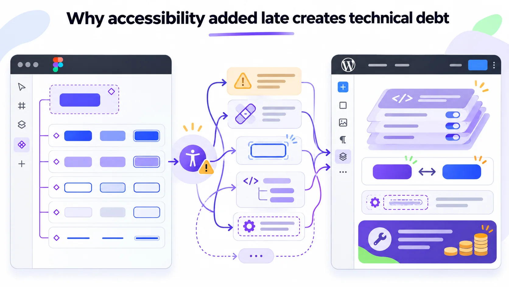
Why accessibility added late creates technical debt
When visual states are not established during design, development often compensates with increasingly specific CSS.
A general button style may initially work across the website.
Later, an accessibility review identifies that focus indicators are insufficiently visible in a particular section.
A local override is introduced.
Another component requires a different outline color because of its background. A second override is added.
An existing border interferes with the focus treatment, requiring further adjustments.
Eventually, styles may depend on combinations of parent classes, block variations, and contextual selectors. In particularly complicated situations, increased specificity or !important declarations may be introduced to resolve conflicts.
Although these techniques can be valid in specific circumstances, relying on them to reconcile undocumented design differences makes the styling system harder to maintain.
The problem becomes more noticeable when the client starts creating new pages.
A reusable block may appear in a context that was not covered by the original page designs, exposing inconsistencies that were previously hidden by local adjustments.
By defining accessible component behavior from the beginning, many of these exceptions can be avoided.
A shared Figma component library improves implementation accuracy
A component-driven workflow depends on more than creating reusable components in Figma. Those components must also be organized, documented, and kept consistent with their usage across the design.
Interactive controls are particularly useful to review together.
Buttons, links, checkboxes, radio buttons, dropdowns, input fields, navigation controls, and similar elements should be available in a shared component library or a dedicated controls section.
Ideally, their variants and relevant states should be visible side by side. This makes it easier to evaluate consistency across the entire interface.
For example, a developer should be able to compare the keyboard focus appearance of a button, a text input, a checkbox, and a navigation link without searching through multiple page layouts or unrelated Figma files.
It also makes inconsistencies easier to identify before implementation begins.
A shared controls section provides a reference for decisions such as:
- Whether focus indicators follow the same general styling rules.
- Whether border radii are consistent across related controls.
- Whether disabled and unavailable states are handled coherently.
- Whether icon sizes, spacing, and alignment follow shared conventions.
- Whether component colors meet the required contrast levels.
- Whether existing components can be reused instead of introducing new variations.
Global changes versus component-specific variations
Another important aspect of a component-driven workflow is defining the scope of design changes.
When the appearance of a button changes in one Figma layout, the developer needs to understand whether that change represents:
- An update to the global Button component.
- An update to an existing named variation.
- A new variation that should become reusable.
- A context-specific exception limited to one component.
These possibilities have very different implementation consequences.
A global change may require updating the theme’s shared styles, affecting every instance of the component.
A new variation may require a dedicated block style or another reusable configuration.
A local exception may be appropriate in a particular layout, but should not unintentionally modify the global system.
Without this distinction, developers risk introducing broad changes that affect unrelated parts of the website or creating unnecessary local overrides for changes that should have been global.
Keeping Figma and implementation synchronized
Design systems evolve during implementation. Some decisions become clearer only when components are tested with real content, browser behavior, responsive layouts, and keyboard navigation.
It is entirely reasonable for Figma to be updated to reflect these refinements.
However, retrospective design updates introduce a documentation challenge when they are not distinguished from decisions made before implementation.
A final Figma file may accurately represent the finished website while no longer reflecting the actual sequence of design and development decisions.
For example, a developer may discover missing interactive states, resolve inconsistencies between page designs, establish responsive behavior, or define accessibility treatments that were not specified in the initial handoff.
If these changes are later incorporated into Figma without an accompanying record, it becomes difficult to distinguish between the original specifications and decisions established during development.
This affects traceability, future maintenance, effort estimation, and process evaluation.
A more reliable approach is to maintain a clear record of meaningful design decisions and refinements.
The record does not need to be complicated. A component-level change log or a shared design-development decision log can identify what changed, why it changed, and whether it was part of the original specification or a refinement made during implementation.
Review your Figma design against the checklist below and track how much of the component system is ready for development.
Interactive Figma-to-WordPress design readiness checklist
To help evaluate how well a Figma design is prepared for WordPress development, I’ve created an interactive checklist covering the essential aspects of a component-driven design system, from global design tokens and reusable components to accessibility, responsive behavior, and development handoff.
Use the checklist to review your design, mark the requirements that have been addressed, and track your progress across individual sections and project phases.
Your selections are saved locally in your browser, so you can return to the checklist and continue where you left off.
What a useful Figma handoff should provide
A development-ready Figma file does not need to anticipate every possible implementation detail.
It does, however, need to communicate the intended design system clearly enough that developers are not routinely required to invent missing visual rules.
For WordPress projects, this means that the handoff should establish a reliable relationship between design tokens, atomic components, composed blocks, responsive layouts, and editor behavior.
Some implementation-specific questions will naturally be resolved during development. Accessibility testing may also reveal improvements that were not obvious during design.
These refinements should be expected and incorporated into the shared system through an explicit feedback process.
Conclusion: Design the system, not just the screens
A polished Figma presentation can communicate a clear visual direction, but visual completeness alone does not guarantee implementation readiness.
For a modular WordPress website, reusable components are the foundation of the final product.
If buttons, links, form controls, and their interactive states are not defined consistently, those gaps eventually become implementation decisions. If accessibility is introduced only after these components have been built, the necessary adjustments may conflict with existing styling and increase maintenance complexity.
A component-first workflow helps prevent these problems.
By establishing global tokens, defining interactive states, validating accessibility requirements, and documenting component variations before assembling complex page layouts, design and development can work from a shared set of expectations.
The result is a WordPress website that is more consistent, easier to maintain, more resilient to editor-managed content, and better prepared for accessibility requirements.
The measure of a development-ready design is not only how accurately its pages can be reproduced, but how consistently its components can be reused when entirely new pages are created.