
A Grid-First Approach to Modern WordPress Block Development
Introduction
After working on countless WordPress projects, I kept running into the same design pattern: a section-like block that starts with an introduction and ends with a grid of cards.
You know the one — a headline, maybe a short paragraph, followed by two to four feature cards underneath.
Every. Single. Project.
And every single time, I rebuilt it from scratch.
I fought inconsistent spacing, patched layouts with media queries, and tried to stop content editors from breaking the structure by inserting the wrong blocks in the wrong place. Margins stacked where they shouldn’t, cards wrapped awkwardly, and small design tweaks turned into CSS archaeology.
I needed a better solution — one that would:
- Enforce structure, so layouts don’t fall apart
- Maintain consistent spacing, without margin hacks
- Reduce long-term maintenance, instead of adding more CSS per project
When WordPress introduced native allowedBlocks support in block.json, everything clicked. I finally had the missing piece to solve this pattern properly.
This article is a deep dive into how I built a Flex Grid block to address these problems in a way that’s scalable, editor-friendly, and theme-aware.
I default to CSS Grid whenever possible, especially for layout-driven blocks. Not because it’s trendy, but because it solves real problems cleanly.
When spacing is handled with margins (as many core blocks still do), you quickly run into:
- Inconsistent spacing when items wrap
- Edge cases for first/last rows or columns
- CSS full of exceptions instead of rules
Margins describe relationships between siblings. Layouts need something more structural.
However, when using grid with gap we get:
- Uniform spacing, regardless of wrapping
- No special-case selectors
- Layout rules that are easy to reason about
This is exactly why I chose a grid-first approach instead of relying on how core blocks currently handle blockGap in many contexts.
Once spacing becomes structural, everything else gets simpler.
As you can notice, this is not a “hello world” block tutorial. It’s a practical walkthrough of patterns I use in real client work. We’ll cover:
- Controlled composition using
allowedBlocksandlocksupport - Dynamic theming via PHP extensions to
theme.json - Reusable patterns with PHP-based block variations
- Responsive layouts using intrinsic sizing and container queries
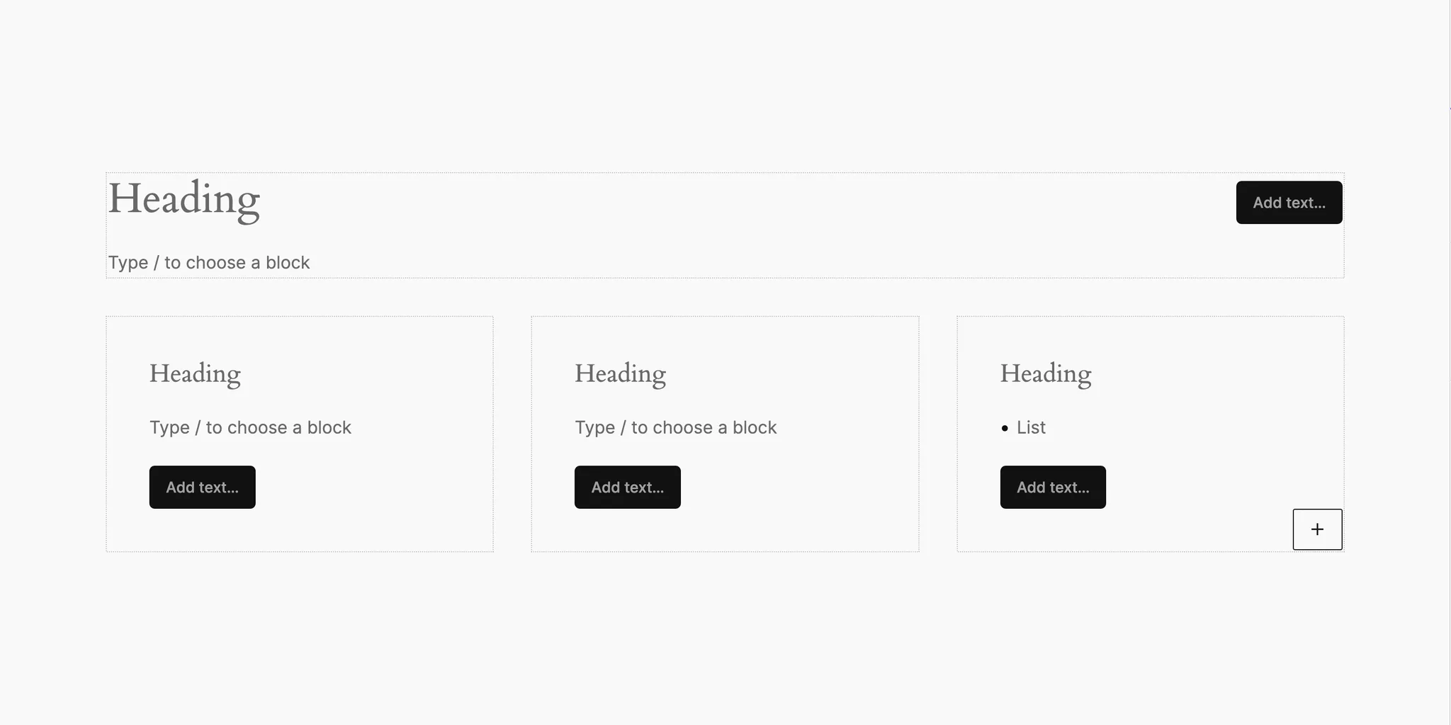
The Flex Grid block acts as a container that creates responsive grids of card-like children — while protecting the layout from accidental misuse.
AllowedBlocks & Lock Support
Everything starts in block.json:
{
  "supports": {
    "allowedBlocks": true,
    "lock": false
  }
}
The "allowedBlocks": true allows the block to control which inner blocks can be inserted.
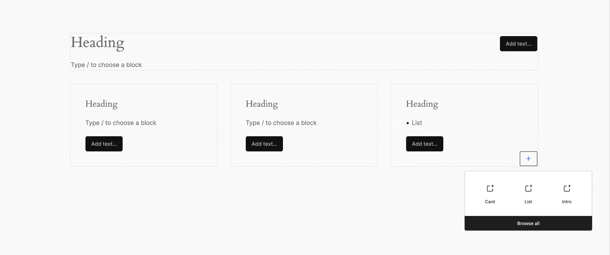
Instead of enforcing one rigid structure, I use variations to define different valid compositions.
registerBlockType(block, {
  edit,
  save,
  variations: [
    {
      name: 'default',
      title: __('Flex Grid', 'katla'),
      attributes: {
        variation: 'default',
        itemSize: 22,
        allowedBlocks: ['katla/flex-card'],
      },
      innerBlocks: [
        // Default structure
      ],
    },
  ],
});
Each variation defines:
- which blocks are allowed (so the editors only see relevant blocks in the inserter)
- the default structure
- the intent of the layout
Instead of documentation saying “please don’t do this”, the editor enforces it for you.
Extending theme.json via PHP
One of the most powerful (and still underused) techniques is extending theme.json programmatically.
add_filter(
    'wp_theme_json_data_theme',
    __NAMESPACE__ . '\\theme_json_defaults',
    10
);

/**
 * Register programmatically the defaults settings and styles of the blocks.
 *
 * @param  \WP_Theme_JSON_Data $theme_json Initial theme json data instance.
 * @return \WP_Theme_JSON_Data
 */
function theme_json_defaults( \WP_Theme_JSON_Data $theme_json ): \WP_Theme_JSON_Data {
	$theme_json->update_with(
		[
			'version'  => 3,
			'settings' => [
				'blocks' => [
					'katla/flex-grid' => [
						'spacing' => [
							'blockGap' => true,
							'margin'   => [ 'vertical' ],
							'padding'  => [ 'vertical' ],
						],
					],
					'katla/flex-card' => [
						'spacing' => [
							'blockGap' => true,
							'margin'   => [ 'vertical' ],
							'padding'  => [ 'horizontal', 'vertical' ],
						],
					],
				],
			],
			'styles'   => [
				'blocks' => [
					'katla/flex-grid' => [
						'spacing' => [
							'blockGap' => 'var:preset|spacing|30',
							'padding'  => [
								'top'    => 'var:preset|spacing|60',
								'bottom' => 'var:preset|spacing|60',
							],
						],
					],
					'katla/flex-card' => [
						'spacing' => [
							'blockGap' => 'var:preset|spacing|20',
							'padding'  => [
								'top'    => 'var:preset|spacing|30',
								'bottom' => 'var:preset|spacing|30',
								'left'   => 'var:preset|spacing|30',
								'right'  => 'var:preset|spacing|30',
							],
						],
					],
				],
			],
		]
	);

	return $theme_json;
}
This hook gives you access to the theme’s JSON data before it’s resolved.
This pattern is so effective because:
- Block styles live with the block
- Spacing presets are reused, not duplicated
- Editors can’t apply destructive spacing
- No theme edits are required
This is especially powerful in plugin-driven architectures.
PHP-Based Block Variations
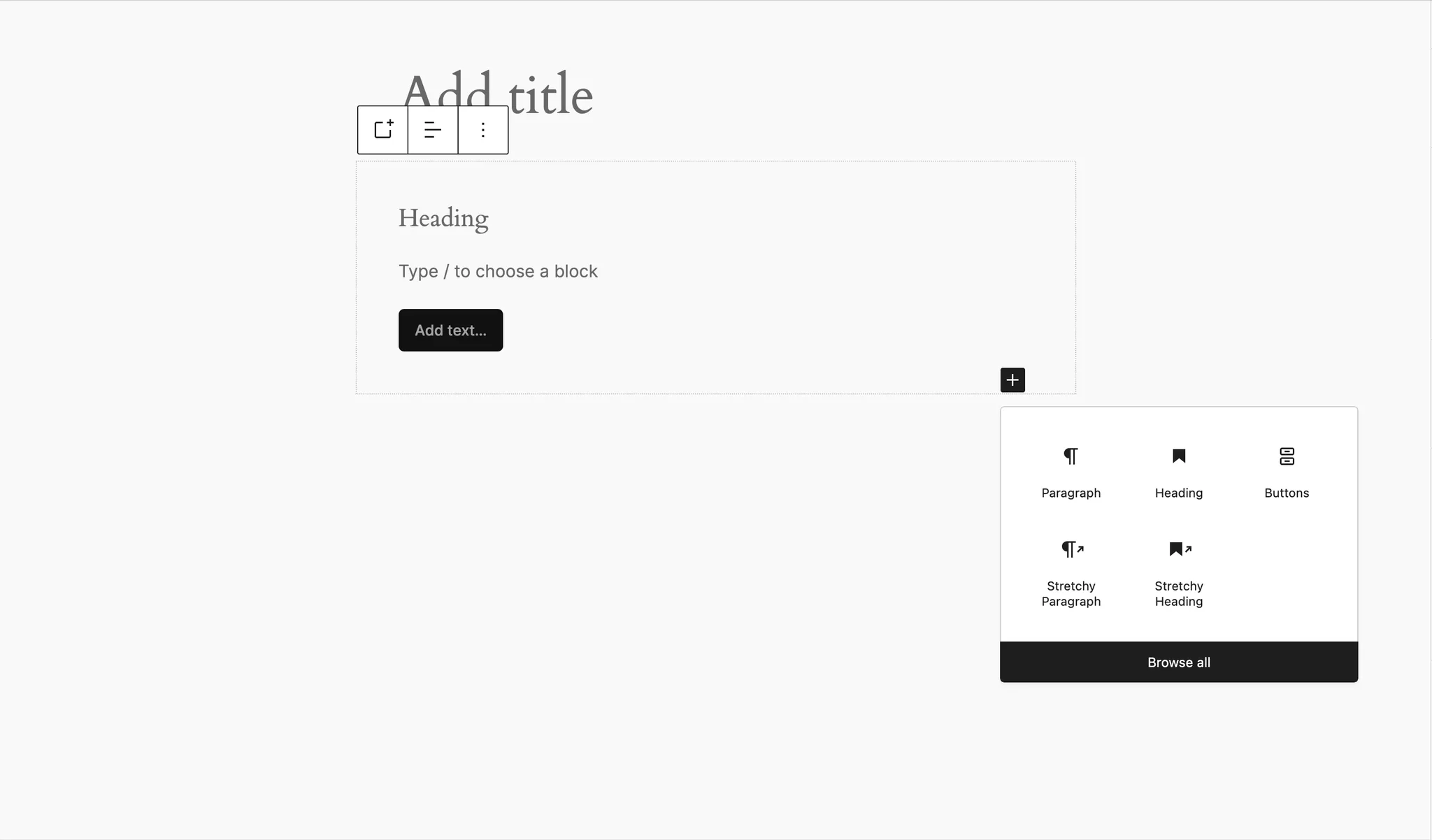
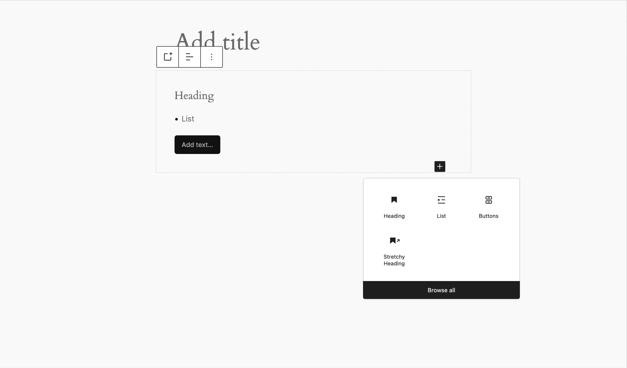
While variations are often registered in JavaScript, PHP variations are far more powerful in plugin contexts.
Registering the custom variation is easy:
add_filter(
    'get_block_type_variations',
    __NAMESPACE__ . '\\flex_card_variation',
    10,
    2
);

/**
 * Register a custom katla/flex-card variation, for testing purposes.
 *
 * @param  array          $variations Block variations.
 * @param  \WP_Block_Type $block_type Block type instance.
 * @return array
 */
function flex_card_variation( array $variations, \WP_Block_Type $block_type ): array {
	if ( 'katla/flex-card' !== $block_type->name ) {
		// Fail-fast, not the block we target.
		return $variations;
	}

	// Add a custom variation.
	$variations[] = [
		'name'        => 'list',
		'title'       => __( 'List', 'katla' ),
		'description' => __( 'A box with title, list, and button.', 'katla' ),
		'scope'       => [ 'inserter' ],
		'isDefault'   => false,
		'attributes'  => [
			'variation'     => 'list',
			'allowedBlocks' => [ 'core/heading', 'core/list', 'core/buttons' ],
		],
		'innerBlocks' => [
			[
				'core/heading',
				[
					'level' => 4,
				],
			],
			[ 'core/list' ],
			[ 'core/buttons' ],
		],
	];

	return $variations;
}
Why the PHP variations win:
- Access to server-side logic
- Conditional registration
- Proper translations
- Plugin-friendly distribution
Once you try this approach, it’s hard to go back.
Fluid Grids Without Media Queries
This block uses intrinsic sizing instead of breakpoints.
.katla-flex-grid {
    container-type: inline-size;
}

.katla-flex-grid__inner {
    display: grid;
    gap: inherit;
    grid-template-columns: repeat(
        auto-fill,
        minmax(min(var(--item-size, 28rem), 100%), 1fr)
    );
}
What’s happening here:
- Columns are created automatically based on available space
- Each column respects a minimum width
- Layout collapses naturally to a single column
- Container queries for isolation
This makes the grid responsive to its container, not the viewport — which is exactly how reusable components should behave.
No breakpoints. No media queries. No guessing.
Full-Width Constrained Blocks
A very common requirement: full-width backgrounds with aligned inner content. The core layout support I use:
{
  "supports": {
    "layout": {
      "allowSwitching": false,
      "allowJustification": false,
      "default": {
        "type": "constrained"
      }
    }
  }
}
And here is the CSS Implementation
.katla-flex-grid {
    display: grid;
}

.katla-flex-grid.is-layout-constrained
.katla-flex-grid__inner {
    margin-inline: auto;
    max-width: min(
        var(--wp--style--global--content-size),
        100%
    );
}
This respects theme widths automatically — no magic numbers required.
Best Practices Recap
- Use allowedBlocks for content governance
- Extend theme.json via PHP for block-level defaults
- Prefer grid + gap over margins
- Avoid breakpoints when intrinsic sizing works better
- Let themes define widths — don’t hardcode them
Final Thoughts
The Flex Grid block exists because I was tired of rebuilding the same layout and fighting the same spacing issues across projects.
By combining:
- block supports
- PHP theme extensions
- programmatic variations
- and modern CSS
You can build blocks that are flexible for editors, predictable for designers, and sane to maintain as a developer.
Further Reading
Note: The article featured image was generated using Adobe Firefly AI technology.