
Creating Grid Columns with Uneven Row Heights, Resembling column-count, While Preserving Element Order
This straightforward demonstration illustrates how to achieve a masonry effect within a grid layout featuring columns and rows of varying content heights. It closely resembles the column-count approach while ensuring the preservation of elements order.
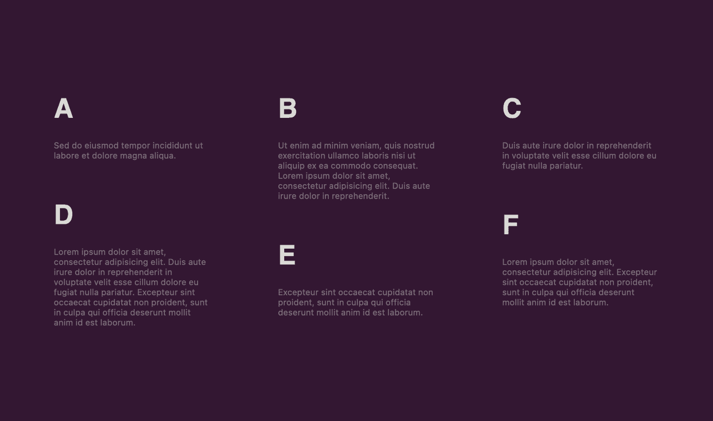
How Content Columns Work
There are several ways to display content in columns, including the use of flex, grid, or even columns or column-count. We choose one of these methods based on our desired outcome, as it simplifies the implementation.
The simplest way to achieve this is by utilizing the column-count CSS property, which divides an element’s content into a specified number of columns. This arrangement stacks the elements vertically in columns without any gaps, even when they have varying heights. This creates the desired masonry effect but has one drawback: the elements don’t appear in the expected order.
For example, when content is displayed in two columns:
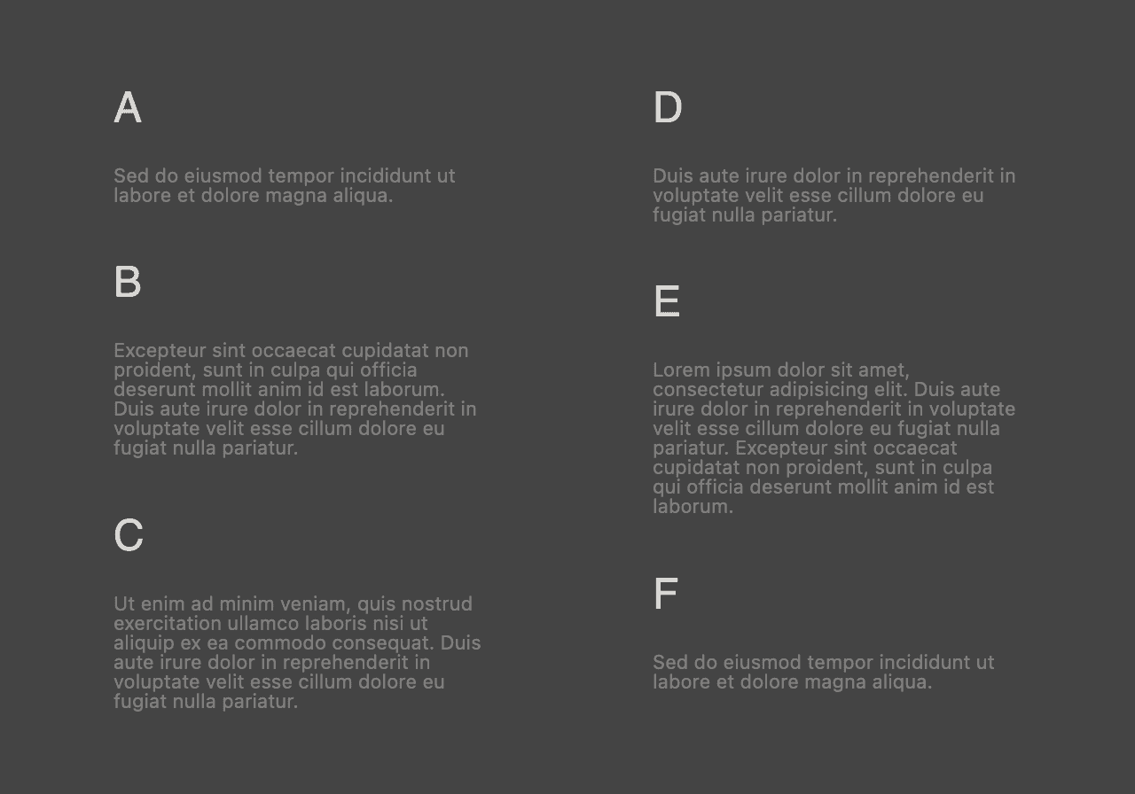
As we can see, the content looks visually appealing but lacks the correct element order.
The Desired Result
The desired result is this:
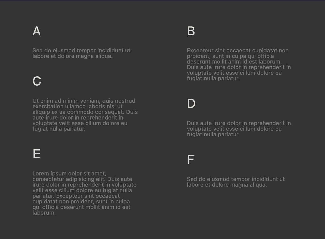
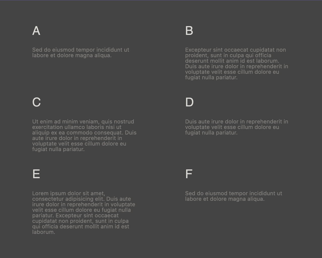
While using a grid display ensures the elements maintain the expected order, it leads to each row starting at the same level, making it impossible to achieve the masonry effect.
Live Demo
The demo employs the regular CSS property display: grid for the wrapper element. For demonstration purposes, we limit the number of columns. Additionally, the solution incorporates vanilla JavaScript (without dependencies) that iterates through the grid elements.
Each element can then be positioned vertically with the expected margin-block-start, taking into account the previous element in the same column, its size, and, of course, the grid row gap for consistency.
For additional options on aligning content within the grid, feel free to explore my other demo: Free CSS and HTML Grid Generator – Demo and Code Snippet. If you want to see the Latest Post Shortcode setup demo with the “masonry style” enabled, you can see it at Exploring the Latest Post Shortcode Configuration and Results or at LPS 14.2.0 New Features Live Demos.